Layout Changes
Layout is the first and quickest way to improve the GUI. This simply involves following some simple GUI design rules to improve the initial layout of the controls. Therefore it only involves in moving the controls around and can be implemented for a short term, quick fix job.
The rules are:
- Group controls sensibly.
- Add bordering or a divider between the groups.
- Align controls into neat columns, even enlarging controls by aligning the right hand sides with above and below.
- Making show the rows are aligned, including the label text with the text in the controls (such as a text-box).
- Evenly space controls. Different size gaps between controls can add to the untidiness.
- Eliminate any large spaces on the overall form.
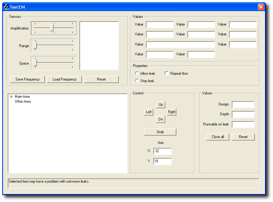
Lets apply these rules to our example.
Starting with the top left hand corner:
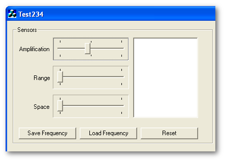
Its not obvious from first impression that most of these controls are related. These control the robot and give feedback for the robot's sensors. So the first thing to do is to make their grouping more obvious. Since we are currently limited to ye-old style, I'm going to use the basic group container, which has already been used on other parts of the form. When we get to the design work this will change to something nicer.
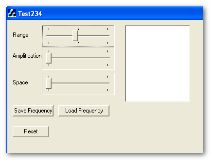
Now to tidying up the controls them selves:
- First we align the labels. Right alignment by butting up to the related controls always works well. The vertical alignment should be centred to the slider controls.
- The slider controls should be more evenly spaced.
- The bottom of the text output should align with the bottom slider control.
- The buttons all need to be of the same width and height.
- Lastly the buttons should be aligned in a row.
There, it's looking better already. Now we do same for all the other groups. One thing I'm also going to do is move around some of the groups. Their current positions seem a bit random as the application has grown organically. I think the more important groups need to be either top or middle of the dialog. Firstly I think the 'Values' and the 'Properties' should be stacked on top of each other rather than side by side to give more width to each group.
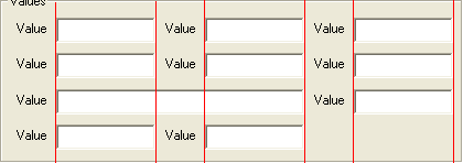
Ignoring the fact that the example labels are all set as 'Value', we can align the textboxes by creating imaginary columns (in red):
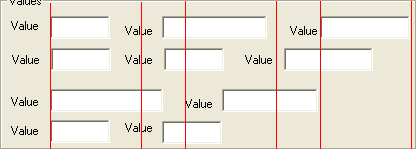
If we shift all of the right hand ends of the labels and textboxes up to the columns from their original positions we get this:
Much neater, I think you'll agree.
There is not a lot we can do to the properties group, just a bit of a move around. With the second row of groups we can do a lot with the space being used. Firstly by aligning the right hand side of the list with the above 'Sensors' group we can allow a larger list for more information and follow the alignment rule a the same time.
With the 'Control' group I feel this is more important than the 'Valves' group and will probably get a lot more use, especially with the mouse. So it makes much more sense for it to be in the middle of the row rather than at the end, it feels more comfortable there. The 'Grab' button, which is obviously going to be used a lot judging by its size should be directly below the controls and have alignment as well. The 'Axis' controls, which are obviously for output (remember a good designer will liaise with the developers and even the users to find out this information.) so they can be put at the bottom.
Finally the 'Valves' group. Again by creating imaginary columns and aligning up the labels and controls to these columns we get a much tidier layout. Note also the groups all line up which uses a bit of space, but overall the dialog is small and neater.
There, so after only a days work we have vastly improved the UI of the application, giving a quick and dirty improvement for a release.